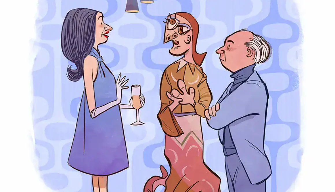
In this Singularities cartoon, a cocktail party introduction goes sideways when a guest meets Picasso’s wife and realizes she looks exactly like one of his Cubist portraits. Picasso stands by with his arms crossed, clearly unamused that his muse is also his punchline. It’s a Picasso cartoon for anyone who has ever stood in a gallery and wondered what the people in those paintings looked like at dinner.
Shag, retro futurism and our strange fixation on a past that keeps getting redrawn
Picture the scene, because you already know it by heart. A cocktail sweats in someone’s hand. A butterfly roof floats overhead, and a kidney-shaped pool glows in the background as if it were lit from underneath. Someone lights a cigarette. Someone else, judging by the sly expression, is probably having an affair. A tiki idol watches from the corner while a suspiciously well-dressed cat surveys the room from the sofa, and somewhere above the mountains a flying saucer hangs in the sky as if it paid rent there. Nobody in this painting looks even faintly concerned about any of it. Welcome to the mid-century, or more precisely, welcome to the mid-century the way we have collectively decided to remember it.
The Artists
The Artists Keeping the Party Going
Those cocktail lounges, jazz records, Googie coffee shops and Space Age fantasies are more than half a century old. Yet this visual language still refuses to fade. Contemporary artists keep borrowing its flattened shapes and exuberant color, along with its unwavering confidence that the future probably requires a martini. Audiences keep buying it, hanging it in their living rooms and building entire personal aesthetics on top of it.
Southern California painter and illustrator Shag, known offstage as Josh Agle, has become the most recognizable face of this revival, and he works in good company. Artists including Derek Yaniger, El Gato Gomez and Tim Biskup have each absorbed pieces of that earlier visual culture and reassembled them into something that belongs to the present. Meanwhile, artists from the original era, including Jim Flora, continue to shape illustrators who were not even born when his album covers first landed in record store bins.
Which raises an obvious question. Why this particular past, and why do artists keep circling back to it decade after decade? Most old visual trends eventually drift off to the thrift store and stay there, but this one keeps walking back through the front door. Hiding underneath that obvious question is a stranger one: why do people feel nostalgic for a world they never actually lived in?
Here is the first complication. The mid-century that shows up in contemporary art is not necessarily the mid-century that actually existed. It is a remix, carefully edited for content. The architecture stays, the swimming pool stays, the jazz stays and the cocktails absolutely stay. What disappears is the commute, the paperwork, the geopolitical anxiety and the social inequality, along with most of the ordinary Tuesday afternoons that made up the actual decade. What remains is not history so much as mythology.
That distinction matters, because artists working in this tradition generally are not producing documentary illustrations of postwar America. They are selecting fragments of its visual vocabulary and using them to build something new, and Shag makes that point unusually explicit. His official biography describes his lavish, retro-tinged interiors as little more than window dressing or stage scenery. He cares far more about the stories happening inside the paintings, and about whatever meaning a viewer finds there. The cocktail lounge, in other words, is not the subject. It is where Shag puts the subject, the way a set designer might build a stage for a play nobody has written yet. That is also why calling this work merely “retro” undersells it. The past supplies the props. The artist writes the play.
Everybody Has a Martini, Nobody Has a Mortgage
Spend enough time with mid-century-inspired art, and you may start wondering whether anyone in this universe holds down a job. Figures lounge, flirt and throw parties beside swimming pools in houses that today would list for an alarming number of zeroes. None of this happens by accident. Artists working in this tradition have extracted one of the most seductive ingredients of postwar advertising: leisure itself.
Advertising and illustration back then rarely sold people a plain product. They sold the life the product supposedly unlocked. A house was never only a house; it represented modern living. A cocktail was never only a drink; it signaled sophistication. A hi-fi set was never only an appliance, because it meant you belonged to the kind of household where attractive strangers turned up in the living room while a jazz record spun somewhere in the background.
Contemporary artists inherit that visual vocabulary without having to believe the sales pitch behind it, and the gap between the imagery and the illusion is exactly where they start having fun. Shag’s paintings turn especially interesting here. Their glossy surface often hides something murkier underneath, with excess, temptation and tangled relationships playing out as human beings behave badly in gorgeous rooms. The party looks fun. Something, though, always seems to be happening at the party.
The past supplies the props. The artist writes the play.
The Lineage
Flat People, Big Personalities
Then there is the way this world gets drawn in the first place. Much of the mid-century visual vocabulary abandoned the idea that an illustration needed to resemble a photograph. Shapes flattened out, perspective bent into odd new angles, and backgrounds often vanished altogether. A nose could collapse into a triangle. A hand could reduce itself to a handful of confident lines, and a musician could nearly dissolve into pure rhythm, all elbows and sound.
That visual economy spread across commercial illustration, advertising, animation, album covers and graphic design throughout the era. Few artists pushed it with more unhinged energy than Jim Flora. His jazz album covers for Columbia and RCA Victor detonated with impossible bodies, sharp geometry and visual syncopation, and his musicians ended up looking less like people playing music than like the music itself had grown arms and legs.
His influence did not end when the records went out of print. Tim Biskup has described standing in a record store, holding a copy of Shorty Rogers Courts the Count, and realizing on the spot that the cover would change the way he drew for good. Gary Baseman has called Flora’s covers visual jazz, playful and improvisational in a way few illustrators before or since have matched. That is how a visual language actually survives. It lives on through mutation in somebody else’s sketchbook rather than through preservation in a museum case.
This is where the story grows bigger than contemporary retro art alone. Artists never really work in a vacuum, and the mid-century visual vocabulary grew out of a collision between modern art, illustration, animation, advertising and architecture. Those influences kept traveling forward long after the era that produced them had ended. Sometimes an artist can trace the lineage precisely, but more often they cannot.
One artist stumbles on an old record cover in a thrift store. Another discovers a box of vintage advertising illustrations at an estate sale. A third grew up watching cartoons whose designers had absorbed modern art without ever naming their sources out loud. The influence travels from Picasso and Miró into graphic design, and from graphic design into animation. From animation it moves into somebody’s childhood memory, and from childhood memory into a painting hanging in a gallery today. By the time it arrives, nobody is copying 1955 anymore. They are responding to generations of people who spent decades responding to 1955 first, and that layering is how an aesthetic eventually becomes a language, complete with its own grammar and its own inside jokes.
The Screen
Saturday Morning Was an Art School
That third artist, the kid parked in front of the television, may be the most important link in the entire chain. Long before most of us ever heard the name Jim Flora, we had already absorbed his visual grammar through cartoons. The handoff traces back to the early 1940s, when several artists left Disney in the wake of its 1941 strike and went on to build United Productions of America, better known as UPA. The new studio wanted animation to look like modern art rather than a storybook come to life. Its 1950 short Gerald McBoing-Boing, about a little boy who speaks only in sound effects, used flat color, sparse backgrounds and bold graphic shapes that owed more to modern painting than to Bambi. It won the Academy Award, and suddenly every studio in town wanted to look modern.
Disney absorbed the lesson through Mary Blair, whose concept art for Cinderella, Alice in Wonderland and Peter Pan pushed the studio toward daring color and simplified shapes, and who later designed the look of “it’s a small world.” By the end of the decade, Eyvind Earle had given Sleeping Beauty its razor-sharp, stylized forests. Over at Warner Bros., layout artist Maurice Noble built angular, candy-colored alien landscapes for Chuck Jones. Their 1953 short Duck Dodgers in the 24½th Century remains one of the purest pieces of retro futurism ever put on film, even though nobody at the time would have called it retro anything. As far as its audience knew, it was the future.
Then in 1962, Hanna-Barbera beamed the Space Age straight into American living rooms with The Jetsons, a prime-time family comedy set among Googie towers and flying cars. For the kids who caught it in reruns for decades afterward, that show became their first memory of tomorrow. It also turned into one of the richest sources of the borrowed nostalgia we will get to in a moment, because an entire generation learned what “the future” looked like from a cartoon made before they were born.
The line kept running. In the 1990s, a new crop of CalArts-trained animators brought the UPA look roaring back on Cartoon Network, as Genndy Tartakovsky’s Dexter’s Laboratory and Craig McCracken’s The Powerpuff Girls built whole shows out of flat color, hard angles and mid-century graphic design. Tartakovsky pushed that approach even further with Samurai Jack, and Pixar followed in 2004 with The Incredibles, a superhero film that looks like a 1960s spy thriller filtered through a Palm Springs architecture tour. For plenty of today’s retro artists and their fans, these shows were the real art school. They learned the vocabulary on a Saturday morning, cereal bowl in hand, years before anyone taught them the word “modernism.”
The Revival
Derek Yaniger Is Still at the Cocktail Party
Derek Yaniger embraces the retro universe without much apology. His own bio describes work drawing inspiration from tiki, beatnik culture, jazz, rockabilly, burlesque and cocktail culture, and those influences announce themselves instantly through his angular characters, restrained palettes and kinetic graphic shapes. Tiki alone carries a lineage worth its own article. The fantasy of a Polynesian escape took root in Hollywood in the 1930s at Don the Beachcomber’s bar, spread through postwar suburbs one backyard luau at a time, and landed at Disneyland in 1963 with the Enchanted Tiki Room. Like the rest of this mythology, it was an invented paradise from the start, which makes it perfect raw material for an artist with a sense of humor.
Yet Yaniger’s work never feels like someone recreating an old ad for a cocktail brand that vanished decades ago. It carries too much personality of its own for that, because Yaniger takes the old vocabulary and speaks it in his own accent. That distinction turns out to matter for this entire conversation. Revival art becomes interesting the moment it stops functioning as imitation. A reproduction asks how someone drew a thing back then, while a contemporary artist asks what he can do with that same vocabulary right now.
Then things get delightfully strange. El Gato Gomez works in the language of retro futurism. Her paintings, as one profile puts it, mix sleek mid-century homes and cocktail-era glamour with sci-fi cars and flying saucers, and a small standing army of cats often crowds into the very same canvas.
That contradiction sits right at the center of retro futurism as a genre. We are looking backward at people who spent their whole careers looking forward, which means the future on display never actually happened. Somehow we manage to miss it anyway, the way you might miss a vacation you never took because the brochure looked so convincing.
Tim Biskup demonstrates why nobody should treat this as one tidy retro-art movement with a single set of rules. His work has moved through abstraction, figurative painting, sculpture and graphic experimentation over the years. Yet earlier visual influences, Flora chief among them, still run somewhere underneath the surface.
That is useful, because it shows what influence actually looks like in practice. Loving a 1950s album cover as a teenager does not obligate anyone to spend an entire career painting cocktail lounges. Influence can go structural instead, living on in shape, rhythm, composition and attitude long after the source material has become nearly invisible to the naked eye. The DNA stays behind even after the recognizable image itself has disappeared.
Which brings us back to Shag. Josh Agle’s paintings offer some of the clearest evidence anywhere of how mid-century imagery can turn into something contemporary rather than merely nostalgic. His characters inhabit spectacular environments crowded with architecture, cocktails, fashion and consumer objects, and his paintings have traveled to exhibitions around the world. The Shag Store in Palm Springs plants the work inside one of the great surviving strongholds of mid-century American culture.
Yet the paintings never just ask you to wish it were 1960 again. They run on narrative from top to bottom. Something has already happened, and something else is about to. Someone in the painting clearly knows something the others do not, and someone probably should not be standing quite that close to someone else. The viewer always seems to arrive in the middle of the scene, several drinks and one significant glance too late to have caught the beginning.
That narrative pull may explain why these paintings reward long, slow looking. A glance on the way past will not do. You do not just register the style and move on, because you start inventing the story yourself, whether Shag intended you to or not.
Now for the truly strange part. Plenty of people who love this imagery were not alive when the original visual culture existed in the first place. Researchers call that broader phenomenon historical nostalgia, and the internet has given it a prettier name, anemoia, a word coined by writer John Koenig for his Dictionary of Obscure Sorrows. Personal nostalgia is the feeling that arrives when a song from your own childhood comes on the radio. Historical nostalgia works differently, involving emotional attachment to a period entirely outside your own lived experience.
In other words, you can miss a party you never actually attended. Researchers who study this have found that nostalgia runs far more complicated than sentimental longing. A widely cited study links nostalgic reflection to meaning and social connectedness, among other psychological functions people rarely associate with the word at all. More recent research has specifically examined younger audiences who feel real nostalgia for periods they never personally lived through, and the feeling turns out to be far more common than you might guess.
That matters quite a bit here. Someone born decades after the cocktail lounge’s heyday does not need an autobiographical memory of 1962, because culture happily supplies the memory instead. Movies and old photographs supply it, Jetsons reruns supply it, and so do music, advertising and, yes, artists like Shag. Eventually an imagined past becomes emotionally meaningful even to people who never experienced a single second of it. The feeling is no less real for being borrowed.
The Past Looks Amazing Once You Remove the Boring Parts
Historical nostalgia carries one real advantage over actual memory: you get to edit. Nobody has to feel nostalgic for an entire decade in its unedited entirety. We can keep Saul Bass title sequences, the jazz, the architecture and the general optimism about technology, and all the while we can quietly lose everything nobody particularly wants to bring back.
That selective process is exactly why we should stay cautious about treating retro imagery as history. It functions much closer to cultural collage. Contemporary artists are not necessarily telling us what the mid-century actually was. They are telling us which parts of it still feel useful to borrow today, and that ongoing negotiation is probably why this imagery keeps mutating instead of quietly disappearing like most old visual trends.
You can miss a party you never actually attended.
The Future
Maybe We Don’t Miss the Past. Maybe We Miss Its Future.
One last irony hides inside all of this. Much of the imagery we now file under nostalgic was never looking backward to begin with. It was obsessed with tomorrow, fed by jet travel, atomic energy, television, synthetic materials and space exploration, along with cars styled like rockets and buildings styled like launch pads. Googie architecture pushed that fantasy hardest of all, turning ordinary coffee shops and gas stations into miniature monuments to an imminent future. Mid-century visual culture imagined tomorrow so enthusiastically that even the local diner started looking like it might achieve orbit.
Johnie’s Coffee Shop at Wilshire and Fairfax, designed by Armét & Davis in 1956 and later repainted as “Bernie’s Coffee Shop.” Photo via Wikimedia Commons (public domain).
Now we look back at those old visions of tomorrow and feel nostalgic for them anyway. We have become nostalgic, in effect, for someone else’s future rather than for our own past. That peculiar twist may explain why contemporary artists cannot seem to leave this era alone, as each of them takes pieces of an older visual language and reassembles them into something that belongs to them.
That is what artists have always done, generation after generation. They borrow from the past, reinvent it for the present and hand the whole thing back to us as something new. Mid-century modern art may refuse to disappear for a precise reason: it was never really about remembering the world as it actually was. It remembers the world as somebody once hoped it might become. Evidently, we are still not finished looking at that particular future.
PLUCK LAB No. 002 Subject: Bad Drawings, Great Animation Question: Why do distorted frames and impossible physics make a cartoon feel more alive, not less? Method: Freeze-frames, rubber-hose limbs, the occasional smear frame, and an unreasonable number of Looney Tunes rewinds.
Freeze a great piece of animation at exactly the wrong moment and something terrible happens. Faces stretch sideways. Limbs turn to rubber. Anatomy gives up, and physics follows it out the door. For one disastrous smear frame, the whole thing can look as though someone drew it during an earthquake.
Then you press play.
The ugly drawing vanishes into movement that feels fast, fluid and natural. Remove that ridiculous frame and the animation may actually look worse.
Animators have understood this paradox for generations. They distort drawings because motion sometimes demands it. A pose may hang longer than reality permits, then snap into the next one faster than any human body could move. These aren’t mistakes. They’re calculated violations of reality, and science is beginning to explain why they work.
The answer has less to do with perfect drawings than with the machinery behind your eyes. Your brain doesn’t just receive animation. It helps create it.
Let’s put that idea to the test.
Hypothesis 01
Your Brain Doesn’t Care About Every Drawing
Animation begins with an obvious problem: nothing on the screen actually moves. Bugs Bunny isn’t moving. Neither is Kaneda’s motorcycle in Akira, or the bouncing ball in a student film. You’re watching individual images appear one after another while your brain experiences motion.
Scientists have studied versions of this phenomenon for more than a century. Research into apparent motion shows that the visual system can perceive continuous movement from separate visual events. In other words, an object doesn’t need to appear at every point along its journey. Give the brain the right information at the right moment and it builds the missing motion itself.
Lars Muckli and his colleagues at the Max Planck Institute for Brain Research found something even stranger: neural activity appeared along the path of apparent motion between objects that were never physically connected. The brain wasn’t merely registering Picture A followed by Picture B. Instead, it responded to the movement implied between them.
The road wasn’t there. The brain built it.
The brain fills in the frames you never drew.
Hypothesis 02
Your Brain Is Secretly Working for the Animator
Things get stranger when the moving object looks human. Research into biological motion shows how little information we need before we begin seeing a living body.
In a classic 1973 experiment, Swedish psychologist Gunnar Johansson reduced a walking person to a handful of moving dots placed at the joints. The body disappeared, and so did the face. Yet once those dots began to move, somebody was walking across the screen.
That’s because our visual system is remarkably sensitive to those relationships. Writing in Current Biology, Mark Johnson described research by Nikolaus Troje and Cord Westhoff proposing a perceptual “life detector” tuned to the movement of walking limbs. Even when much of the visual information disappears, the impression of life survives.
Animation lives in that gap.
Mickey Mouse isn’t alive. Neither is WALL-E. After all, each is an arrangement of shapes changing over time. Yet somewhere between one image and the next, we stop seeing shapes and start seeing somebody.
Hypothesis 03
Breaking Physics Can Actually Help
Consider one of animation’s oldest crimes against reality: squash and stretch.
A real rubber ball deforms a little when it hits the ground. An animated ball may flatten into a pancake before shooting upward like a missile. Nothing in the real world behaves quite like that, and yet it still looks right.
Filipp Schmidt and his colleagues tested this question in a 2024 study published in Cognition. They showed viewers bouncing balls with different degrees of squash and stretch, including deformation well beyond physical possibility. In fact, mild exaggeration looked just as plausible as realistic motion. When the researchers left the ball’s material unspecified, viewers tolerated even greater distortion before the illusion broke.
Zero: the number of real-world balls that squash and stretch the way a cartoon ball does.
Apparently the visual system doesn’t employ a tiny physics professor waiting to object when a ball exceeds its approved deformation coefficient. Perception allows some latitude instead. An animator can violate literal physics while preserving what the researchers call perceptual plausibility.
That distinction explains a great deal about animation. Something doesn’t have to be physically accurate to feel right.
Field Notes
The Rules Were Written by Hand
Squash and stretch didn’t come out of a research lab. Disney animators worked it out on their drawing boards in the 1930s, refining it on shorts like Three Little Pigs until the bouncing, breathing ball became a calling card of the studio. Decades later, veteran animators Frank Thomas and Ollie Johnston put it on paper for good in their 1981 book The Illusion of Life: Disney Animation, where squash and stretch lead the list of what the industry now calls the twelve basic principles of animation.
Of course, nobody in that studio had an MRI machine or a psychology journal. They had pencils, mirrors, and stopwatches, plus an audience that either laughed or didn’t. The science caught up decades later, and mostly it confirmed what those animators had already learned by watching people watch cartoons.
Hypothesis 04
Exaggeration Isn’t a Bug, It’s Information
Animators don’t exaggerate movement just because it looks funny. Sometimes exaggeration makes the important part of a movement easier to see.
Harold Hill and Frank Pollick put that idea to work in a study published in Psychological Science. Participants learned to recognize six people from point-light displays of their arm movements. The researchers then exaggerated the timing differences between those movements, stretching some segments and compressing others, and recognition improved. Nobody added faces or made the figures more realistic. Instead, amplifying the timing alone made each person easier to tell apart.
Six: the number of people participants learned to recognize from nothing but moving dots.
Animation runs this play constantly. For example, a nervous character’s gestures come quicker and more erratic than any real person’s would. Similarly, a lumbering monster gets a delayed follow-through, heavier footfalls, and a long recovery until its weight practically becomes a character of its own. A caricaturist exaggerates a nose to capture a face. In the same way, an animator exaggerates timing to capture a movement.
Hypothesis 05
Perfectly Smooth Isn’t Always Better
This leads to one of animation’s great misunderstandings: more frames don’t automatically make better animation. Motion lives in timing and spacing, meaning when each image appears and how much changes between them. An animator can hold a drawing, rocket into the next pose, pause for anticipation, and then explode into the action. Those irregularities create rhythm.
Picture someone winding up to throw a punch. The story isn’t in dozens of evenly spaced drawings between the first pose and the last. It’s in the wind-up, the burst of speed, the impact and the recovery. However, spread the same frames out evenly and you can sand away the very thing that made the punch land. In short, animation isn’t illustration multiplied by twenty-four. It’s choreography measured in fractions of a second.
Hypothesis 06
The Smear Frame May Be Doing the Most Work
And now we arrive at the glorious smear frame. (The studio IdeaRocket has a good breakdown of the technique.) Step through hand-drawn animation one frame at a time and you’ll eventually find characters their own mothers wouldn’t recognize. Faces stretch across the screen. Hands multiply. Legs dissolve into streaks, and bodies bend into shapes no skeleton could survive.
Nobody meant for these drawings to be studied one at a time. They exist to be seen in motion. A clean, anatomically correct drawing between two extreme poses can make a fast action look stiff. On the other hand, a distorted in-between sells direction, speed and weight precisely because it isn’t trying to be a good drawing on its own.
To be fair, no study claims that a particular Daffy Duck smear frame fires exactly the right neurons, and this article won’t pretend otherwise. What the research on apparent motion and biological motion does show is the kind of perceptual environment where a smear frame can succeed. After all, audiences don’t grade each frame for anatomy. They experience the movement the whole sequence creates, and that’s a very different thing from judging a still image.
Hypothesis 07
Your Brain Wants to Find Something Alive
Perhaps the strangest part of all this is how readily we see life in the first place. Movement carries intention almost automatically. When something darts away, hesitates or creeps forward and then bolts, we start assigning it agency before we’ve spotted a face, sometimes before we’ve spotted a body at all.
Researchers are still mapping the neural machinery behind that sensitivity, and the “life detector” idea from Hypothesis 02 helps explain it. Animators work in that territory every day. Put two dots on a circle and you’ve made a face. Make the circle hesitate before jumping a gap and it seems nervous. Let it wobble after landing and now it seems relieved. The animator never added a mind to the drawing. The audience did.
Findings
The Drawing Was Never the Point
This may be animation’s greatest trick. It’s tempting to assume a cartoon succeeds when its drawings are beautiful, but animation has spent more than a century proving almost the opposite. Characters get four fingers instead of five. Faces stretch three feet across the screen. Wheels spin backward while the car races forward. A coyote runs off a cliff, looks down, registers his mistake, and only then begins to fall.
None of it should work, and yet it works every time. That’s not only because audiences suspend disbelief for the length of a cartoon. In fact, our perceptual system spends every waking second interpreting incomplete, noisy, and ambiguous visual information, long before anyone dims the lights. Animation hands that system carefully chosen information and lets it finish the job.
That’s why a gorgeous illustration can make terrible animation, while a genuinely ugly smear frame can make something brilliant. Animators figured out the trick decades before neuroscience had the tools to watch the brain fall for it.
The cel may be scanned into a computer now, and the rubber-hose limbs may render in three dimensions instead of ink. Somewhere behind your eyes, the same old trick is still running, turning a pile of drawings into somebody worth watching.
Run the Experiment Yourself
Pull up any fast piece of hand-drawn animation you love and scrub through it one frame at a time until you land on the ugliest drawing you can find. Usually it’s a smear frame, with a stretched face or an arm dissolved into streaks. Then let go and watch it at full speed.
WHY READ ITBrain imaging caught the visual cortex tracing a path between two flashes that never actually moved. Your brain drawing the in-betweens, on camera.
WHY READ ITThe original point-light walker. Johansson put lights on a few joints, filmed people in the dark, and viewers instantly saw somebody moving.
WHY READ ITResearchers exaggerated the timing of people’s arm movements and made them easier to recognize. In other words, animators have run that play for a century.
For about a century, comics lived on paper. A cartoonist drew a page, a reader took in that page, and then the reader turned it. That rhythm was so familiar that most of us stopped noticing it existed. Then comics moved onto the phone, the page quietly vanished, and vertical scrolling took its place. Suddenly the story didn’t arrive in spreads anymore. It arrived one thumb-flick at a time.
At first glance, a webtoon looks like a regular comic that has been unstacked and laid end to end. However, the more closely you look, the stranger the change becomes. When comics moved onto the phone, the reader’s thumb became part of the storytelling. Researchers and the platforms themselves are now documenting what that shift actually does to the way we read.
So let’s treat it like an experiment and run it through a few hypotheses.
Hypothesis 01
The Page Was Doing More Than We Thought
A printed comics page is a remarkably sophisticated machine. Before you read a single word balloon, you have already glimpsed the whole page at once, including its big splash panel, its tiny reaction shots and the general shape of what’s coming. The cartoonist designs that entire composition to steer your eye, and it mostly works.
Eye-tracking research backs this up. In a study published in Applied Cognitive Psychology, Clare Kirtley and her colleagues tracked readers’ eyes across six different page layouts. They found that the outlines of the panels themselves do most of the work of telling readers where to go next, while text placement nudges the route in certain layouts. In other words, the page’s architecture is a set of directions.
Experience matters, too. A 2024 study in the Journal of Eye Movement Researchcompared expert comics readers with novices and found that the experts lingered on the images, while the newcomers spent longer on the text. Seasoned readers, in other words, have learned to read the pictures.
Meanwhile, the page hides one of the oldest tricks in comics. Scott McCloud famously described the gutter, the blank strip between panels, as the place where readers perform “closure,” mentally supplying whatever happened between two drawings. The page turn is that same gap made physical, because the cartoonist can plant a question on the right-hand page and hold the answer until you flip it.
Then the phone came along and took the page away.
The infinite canvas segment starts around 13:34.
Hypothesis 02
The Screen Became a Keyhole
Back in 2000, years before the iPhone, McCloud predicted part of this in his book Reinventing Comics. He called the idea the infinite canvas, which he described as “treating the screen as a window rather than a page.” Vertical scrolling turned that window into something closer to a keyhole. You no longer see the whole composition. Instead, you see one slice of a canvas that may be dozens of screens tall, and the rest stays hidden above and below the glass.
That changes what readers pay attention to. For example, researchers publishing in Scientific Reportsshowed comics to 18 readers one panel at a time and collected more than 99,000 viewing times across seven volumes. The time people spent on each panel tracked closely with how much text was in its balloons. The images themselves, it seems, get absorbed very quickly once a reader isn’t scanning an entire page.
A 2026 study from National Taipei University of Technology, published in SAGE Open, tested three reading interfaces on 24 readers: a full page, a single-frame scrolling view and a guided view that walks the reader from panel to panel. The single-frame format made complex stories easier to follow, but readers found it less satisfying to look at. Guided viewing also helped readers with less comics experience recall more of the story and feel more engaged with it. Meanwhile, most of the fluent readers still preferred the full page.
The keyhole makes the story easier to follow. It also takes away the view of the whole page.
Hypothesis 03
Empty Space Became Time
This is where vertical scrolling gets genuinely new. On paper, the gutter between two panels is usually a thin, uniform strip. In a webtoon, however, the creator can make that gap as long as they like, and the reader has to physically travel through it.
Francesca Benatti’s Cambridge University Press study Innovations in Digital Comics spells out the mechanism. Because wider space between panels requires more scrolling before the next image appears, creators can use that distance to “express the duration of time.” The empty space isn’t padding. It’s a clock.
An essay in The Comics Journal goes further. In webtoons, it argues, the gutter stops being a mere break and starts narrating. A long stretch of gutter can imply that a great deal of time has passed or that the scene has changed. The gutter’s color can set a mood, with soft pastels for romance or darkness and rain for dread. Creators even move captions and dialogue out of the panels and into the gutter itself.
In print, the gutter separates moments. In a webtoon, the gutter becomes time.
Here’s what that feels like. Keep scrolling.
Still here? That pause you just scrolled through was the story.
Nothing was drawn in that space, and yet it took you a moment to cross it. That moment is exactly what a webtoon creator gets to design.
Hypothesis 04
Vertical Scrolling Replaced the Page Turn
Print cartoonists have always had one great weapon for suspense, and it’s the page turn. Put the setup on the right-hand page, hide the payoff on the next one, and the reader’s own hand delivers the surprise. On a phone, that physical mechanism disappears. Suspense doesn’t, though. It just moves somewhere else.
In a webtoon, the creator controls whatever sits below the bottom edge of the screen. As a result, the reader has to physically reveal the next moment. The setup appears, the thumb scrolls, a stretch of empty space goes by, the thumb keeps scrolling, and only then does the reveal slide into view.
The Comics Journal essay offers a chilling example from a Korean horror webtoon. In the printed version, a reader can glimpse a character’s dead daughter entering in the next panels, because they sit right there on the open page. In the webtoon, by contrast, the reader must scroll down to discover what the character is staring at. By controlling the order in which panels appear, the scrolling format builds tension that the printed page gives away. That’s why horror and suspense have thrived in the format.
The reader isn’t merely watching the timing, either. They’re performing it.
Field Notes
The Readers Have Already Voted
Vertical scrolling isn’t a niche experiment. In its second-quarter 2026 results, WEBTOON Entertainment reported approximately 155 million monthly active users and $338.5 million in quarterly revenue, $263.9 million of it from paid content. Those numbers don’t prove that scrolling caused the audience. Still, they show that a storytelling format built around the thumb now supports a very large entertainment business.
On September 21, 2026, WEBTOON and National Research Group released Inside Webcomic Fandom, a survey of more than 500 U.S. readers ages 13 to 49 who read webcomics at least monthly, along with interviews with creators. Because WEBTOON commissioned it, it’s best read as industry research rather than independent science. Even so, a few results stand out. Ninety percent of those readers said they often choose webcomics over other entertainment, and half said they browse social media less while reading them. In other words, one kind of scrolling is competing with another.
90%: the share of surveyed webcomic readers who say they often choose webcomics over other entertainment.
The platforms are nudging creators in the same direction. Tapas, for example, tells artists in its featuring guidelines that “vertical-scroll comics can easily be read on both the website and mobile devices,” and it favors mobile-friendly series for features.
Hypothesis 05
The Reader Runs the Projector
Vertical scrolling often makes comics behave more like film than like print. A tall establishing image can unfold as the reader travels down it, much like a camera tilting across a skyline. Meanwhile, a string of tight panels can speed things up the way quick cuts do in an edit. Creators talk about shots, beats and reveals as much as they talk about pages.
Unlike film, however, nobody else is running the projector. The reader decides how fast the story moves, when it pauses and whether to scroll back up for another look. The creator can only shape the road with distance, size and placement, and then hand the steering wheel to the audience.
That trade-off shows up in the research. The artists interviewed for the Taipei study said guided and scrolling formats give them “clarity and pacing control,” but they also worried about losing their carefully designed page compositions. Every format gives something and takes something. Vertical scrolling gives up the grand view of the page, and in exchange it gets precise control over the order and timing of every reveal.
Findings
The Reader Became Part of the Edit
It would be easy to sum all of this up by saying that phones made comics vertical. That’s true, but it misses the more interesting point. The printed page gave cartoonists control over space, meaning what sits beside what and what the eye catches first. Vertical scrolling gave them control over something a page never could, which is distance.
A webtoon creator decides how far your thumb has to travel before you see what happens next. That distance becomes silence, suspense, the passage of time or a punchline held just out of view. Because the reader physically covers that distance, they become part of the storytelling system, a sort of editor who can only cut where the creator lets them.
Comics didn’t lose the page turn. Instead, they stretched it out and put it under your thumb.
The next time you’re lost in a webtoon at 1 a.m., notice the moment your thumb hesitates just before a reveal. That hesitation isn’t an accident. Someone drew the empty space that caused it.
Run the Experiment Yourself
Open any webtoon you love and find a big dramatic moment. Then read it twice, first at your normal speed and then with a screen recording running. When you play the recording back, watch where your thumb slows down and where it stops completely. Next, count how many screens of empty space came before the reveal.
You can still recognize cartoons you haven’t watched in decades in seconds. The first few notes of a theme song might do it, or Charlie Brown trusting Lucy with the football one more time. If you grew up a little later, SpongeBob’s unmistakable laugh probably does the trick instead. You don’t need the whole episode. Often you don’t even need the picture, because a sound is enough.
Then something peculiar happens. You don’t just remember the cartoon; you remember watching it. The living room comes back first, along with the cereal going soggy in your lap and a brother or sister sprawled nearby, or maybe the carpet at your grandparents’ house. You even remember waking up ridiculously early on a Saturday, although getting out of bed for school required an act of Congress.
So here’s the puzzle. How does something we watched at eight still hit this hard decades later? Let’s treat it like an experiment and find out. Consider this a very small, very friendly science study, conducted entirely from the couch.
HYPOTHESIS 01
A Cartoon Can Be a Time Machine
Psychologists have studied nostalgia for years, and their findings show it involves far more than missing the good old days. Constantine Sedikides and Tim Wildschut, both researchers at the University of Southampton, define nostalgia as a “sentimental longing for one’s past.” In a series of six experiments, Sedikides and his colleagues found that nostalgia makes us feel socially connected. That connection then strengthens what researchers call self-continuity, a sense that the person you were and the person you are belong to the same story. As a result, people felt more energized and alive.
Matthew Hutson’s write-up of this research in Scientific American Mind describes Wildschut’s view of nostalgia as a kind of psychological immune response, one that kicks in when life throws us small bumps. In other words, that sudden wave of Saturday-morning feeling may be your brain giving itself a tiny booster shot.
Music turns out to be one of the most reliable ways to set it off. In a 2010 study of music-evoked nostalgia, Frederick Barrett and his colleagues found that songs listeners found familiar and tied to their own memories were the likeliest to trigger the feeling. A 2022 review by Sedikides, Leunissen and Wildschut went further, concluding that music-evoked nostalgia carries the same benefits researchers keep finding elsewhere, including a stronger sense of connection and meaning. Few songs are more familiar, or more tangled up in personal memory, than a theme song you heard every week for years.
That explains why the Scooby-Doo opening can knock us sideways. It doesn’t sit in your head as an isolated tune. Instead, it attaches itself to an entire stretch of life, so when a piece of childhood shows up, you don’t retrieve information so much as step into another room.
The cartoon is the key.
The memory waits behind the door.
HYPOTHESIS 02
The Characters Took Up Real Space
There’s another reason those characters stuck around. Researchers use the term parasocial relationship for the one-sided bond in which a viewer feels familiarity, affection or attachment toward someone on the other side of the screen. It sounds like a lab-coat phrase for having a crush on Bugs Bunny, yet the idea holds up surprisingly well, and kids form these bonds with animated characters readily.
A research team from Georgetown’s Children’s Digital Media Center followed up with the parents of 138 children between roughly three and nine years old. They found that favorite characters were more likely to be animated than live-action, and more likely to be person-like. Nearly all of them lived in fantastical worlds.
88.6% of the favorite characters in that study were embedded in fantastical content. Fantasy was the natural habitat, and that’s exactly where cartoons live.
Design plays a bigger role here than most people realize. Animators build characters to read instantly, often in silhouette alone, using exaggerated shapes and a limited set of colors so a kid can identify them from across the room in a fraction of a second. A live-action face has to be learned. A well-designed cartoon character practically introduces itself, and that clarity is a big part of why it lodges in memory and stays there for decades.
When children eventually moved on from a favorite character in the Georgetown study, the relationship had lasted a little over two years on average.
2.16 years: The average length of a child’s bond with a favorite character before the child moved on.
Two years sounds short until you remember how time feels at six, when two years equals a third of your entire life. A character who appears every week, or every day, can accompany a child through birthdays and new schools, and through more ordinary afternoons than anyone could count. None of this means a kid believes Bugs Bunny is a personal friend. It does mean that dismissing these characters as “just cartoons” misses something important. They took up real space in childhood.
HYPOTHESIS 03
Knowing How It Ends Is Half the Fun
Adults have a strange habit of rewatching things. So why do we sit through a story when we already know the ending? A 2026 review in Social and Personality Psychology Compass took on that question. Karen Shackleford and her colleagues at Fielding Graduate University found that people return to familiar stories mainly for comfort and emotion regulation, for social connection and for nostalgia. They also noted that familiar stories are easier for our brains to anticipate.
Cartoons fit that need beautifully. Wile E. Coyote never catches the Road Runner, and Charlie Brown should know better than to try kicking that football again. And yet we watch anyway. Perhaps predictability isn’t a flaw in these situations. Maybe it’s the feature, because real life never tells us what happens in the next scene, while an old cartoon always does.
FIELD NOTES
The Saturday Morning Ritual, Examined
For generations of American kids, cartoons came attached to something today’s on-demand world has largely dismantled: a schedule. Saturday morning wasn’t just when cartoons happened to air. It became a ritual. You rolled out of bed, flipped on the television and poured a bowl of cereal, and for a few hours TV seemed to belong almost entirely to kids. The Saturday Evening Post follows the history of Saturday-morning cartoons from the early 1950s and marks 2014 as the year the last network lineup signed off.
Regulators noticed the ritual, too. When the FCC set the start of its children’s programming window in 1996, it chose 7 a.m. because data showed a “relatively small percentage” of children watching television before then. Later, in a 2000 rulemaking notice, the agency observed that programming aired on a regular basis “is more easily anticipated and located by viewers, and can build loyalty that will improve its chance for commercial success.” In short, a federal agency put in writing that appointment viewing builds devotion.
Then the world changed. Cable expanded, and channels like Nickelodeon and Cartoon Network gave kids programming far beyond Saturday morning. Home video let us own our favorites, DVRs loosened the schedule even more, and streaming eventually blew the doors off the whole arrangement.
115 → 37 minutes: Average daily kids’ viewing of broadcast television, 2000 to 2017. Over the same stretch, internet-based viewing climbed from 2 minutes a day to 123, according to an FCC fact sheet.
The cartoons never disappeared. They escaped Saturday morning.
Depending on when you grew up, you may have caught the tail end of that ritual, or you may never have needed it in the first place. Either way, the Saturday morning lineup left a mark on more than memory. It also taught a whole generation what modern design looked like, a story we trace in Why Do We Keep Reinventing the Mid-Century?
HYPOTHESIS 04
Today’s Kids Are Running a Different Experiment
At this point, it’s tempting to declare that something has been lost. Maybe something has. Still, adults have said the same thing about childhood since approximately forever. Today’s kids hold something earlier generations could barely have imagined: enormous libraries of animation available almost instantly. A favorite episode no longer waits until next Saturday. It returns in thirty seconds.
That freedom comes with a twist. The same Shackleford review warns that streaming algorithms can steer what we return to, trapping viewers in what the researchers call “playlist pasts” shaped by platform design. A generation ago, a network programmer decided what played on Saturday morning. Now a recommendation engine quietly decides which old favorites keep resurfacing, which means the algorithm may end up curating a kid’s future nostalgia.
So the more interesting question is what today’s kids will remember about the cartoon. Will someone in 2055 hear a theme song from a show they streamed obsessively and suddenly feel the sofa cushions and the tablet in their hands? Will a certain character bring back a house their family left decades ago? There’s every reason to suspect that the technology surrounding childhood memories will change faster than the basic human experience of forming them.
FINDINGS
The Cartoon Didn’t Grow Up. We Did.
Perhaps that’s what makes revisiting childhood animation so strange. Cartoon characters don’t experience time the way we do. Bugs Bunny remains Bugs Bunny, and SpongeBob still works at the Krusty Krab. Live-action shows can’t pull off that trick, because their young stars grew up on screen right alongside the audience. A drawn character never has to. It stays exactly the age it was the day we met it.
Meanwhile, the kids who watched them grew up. We went to school and found jobs, moved away and fell in love, lost people and made new friends. Along the way, we became people our eight-year-old selves could never have imagined. Sedikides and Wildschut’s research suggests that nostalgia stitches that story together, linking the person we were to the person we are. That may explain why an old cartoon catches us off guard. We think we’re remembering Scooby-Doo, but underneath, we’re remembering the person who watched Scooby-Doo.
The television set may be gone, and the house may belong to someone else. Saturday morning may not mean anything special anymore. Then those first few notes of a theme song play, and for just a moment, there you are again.
Run the Experiment Yourself
Find a theme song you haven’t heard in ten years and press play. Then notice what shows up first: the music, the room or the person sitting next to you. That’s your data.
Now share your results. Tell us in the comments which theme song got you, and what came back with it. We’re collecting findings.
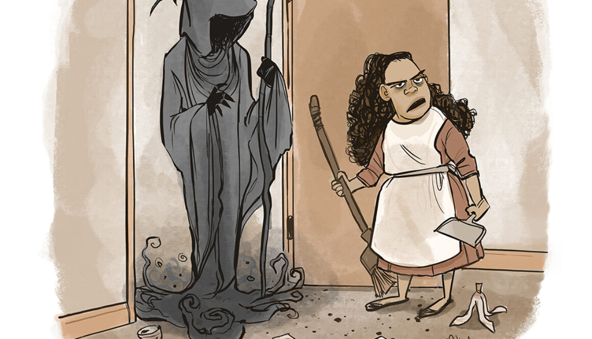
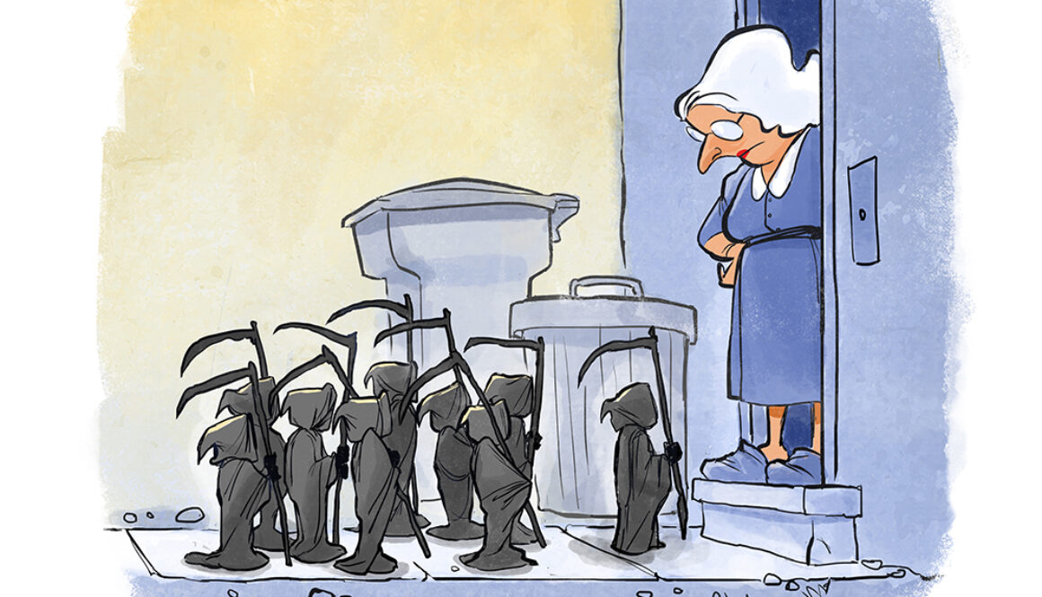
A darkly funny single-panel cartoon about cats, death, and the kind of knock at the door nobody wants to answer.
About Singularities
Singularities is the single-panel cartoon series from String Theory Cartoons. Each cartoon is a standalone burst of humor, built around strange moments, dark jokes, science fiction, everyday absurdity, and the little cosmic accidents that make life weird.
Don’t Miss the Next Singularity
New cartoons are coming soon. A mailing list will be added here for updates, behind-the-scenes sketches, and first looks at future String Theory Cartoons.